ShopDreamUp AI ArtDreamUp
Deviation Actions


Comments8
Join the community to add your comment. Already a deviant? Log In
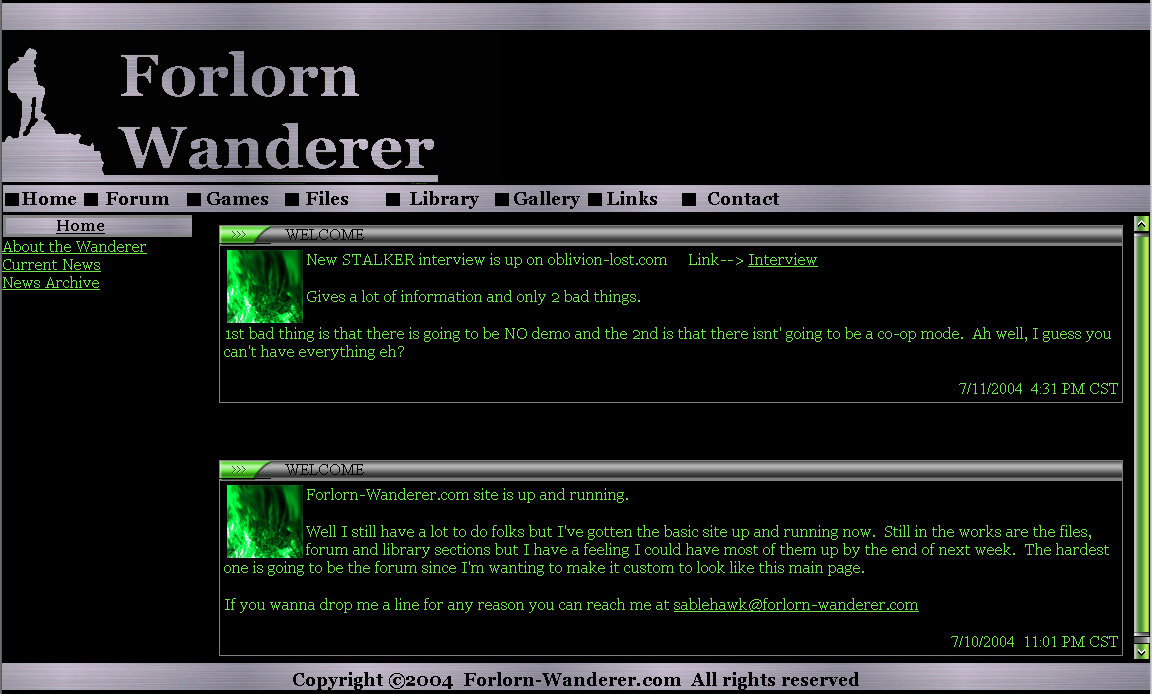
It's really clean and simple. I like that. I think the navigation menu could have a little more to it. Like... not have the links just setting against the side of the page. There should be some sort of distinction between that link section and the body of the page.
The text should have some varying colors... So, the "header" in those welcome boxes might be a different color, or at least shade. Or perhaps just bold the text or increase the size? The date should also have some sort of distinguishing style. Other than that, it's really great =] Especially for a second site. Wow. Did you hand code this, or use a WISYWIG editor?
The text should have some varying colors... So, the "header" in those welcome boxes might be a different color, or at least shade. Or perhaps just bold the text or increase the size? The date should also have some sort of distinguishing style. Other than that, it's really great =] Especially for a second site. Wow. Did you hand code this, or use a WISYWIG editor?